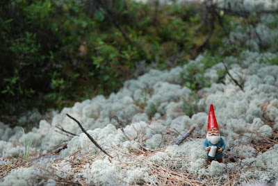
Welcome to the IGCSE Summer Blog for BUPS/BIS (soon to be BLIS) students leaving Grade 8 and entering into Grade 9.

This blog is your guide to your summer assignment: 12 Variations

Over the course of the next few weeks you will be completing 12 different art pieces based around one object of your choosing. This blog will provide you with examples and links to help you with each variation. On average you should aim to complete two variations per week. You will need a sketchbook dedicated to the project. Heavy weight paper is the best.

Your variations are due on the first day of Grade 9 IGCSE Art
in September. Good luck and have fun!

Thursday, July 9, 2009

#9 - Untitled, a Collage Portrait

The Progression

The Collage Portrait is something that you are very familiar with after your portrait series this past year. Based on the idea of reducing a face to some essential shapes, cutting those shapes from different coloured papers and then positioning them all to compile the face of your subject. It looks simpler than it is, in this variation I worked with the 10 x 10 cm format again, and it tested my patience no end as I was cutting shapes that I could barely hold. I might attempt this again in the future in a larger format, so that I can have more fun with the shapes and perhaps shake the colours up a bit.


Sharon Lacoste McDonagh, Untitled, 2009
Cut Paper 10 x 10 cm

Wednesday, July 8, 2009

#8 - Herr Silverbeard, his Silhouette

Sketchbook prep for Variation 8

The Silhouette was a form of portraiture that evolved in Europe in the 1700's. It is traditionally a profile portrait that is created by cutting paper. Real Silhouette artists are very adept at cutting fine detail into their portraits. My portrait of Herr Silverbeard is not quite as skilled, but it is still effective. I used black and ivory coloured papers. The picture here does not capture the texture very well, it looks flat, but in person, the papers create an added element to the overall image, the edges of the silhouette cast their own subtle shadow, giving it a multi-dimensional feel. It was tricky for me to cut a perfect oval, so, after several attempts I drew the oval frame using a fine ink pen.


Sharon Lacoste McDonagh, Herr Silverbeard, 2009
Cut Paper & Ink 10 x 10 cm

Tuesday, July 7, 2009

#7 - Skratt, Léon in Line

This was the easiest variation to do, I draw like this all the time. This portrait is based on the same photograph that I used for variations 1, Léon Silverbeard and 6, the stencil. It is interesting to see how one photograph can produce 3 very different depictions depending on the idea behind them. Drawing with line in this way is very evocative of Art Nouveau and also Scandinavian print design around the 1950's. Art Nouveau was defined by flourishes and plant shapes, especially vines being worked into the imagery.


Sharon Lacoste McDonagh, Skratt, 2009
Ink & Pencil on Paper 15 x 10 cm

Monday, July 6, 2009

#6 - Léon, a Stencil


Last year the Obama campaign was marked by amazing poster work and graphics produced by Shepard Fairey who you should know because of this poster. Stencil art has really hit the streets in a big way in the last few years, first used an unorthodox method to "graffiti" in public places. It was made notorious by artists like Banksy and has eventually been brought into the public realm.

This is also a method that you experimented with last year in you portrait series. I like how Léon feels more serious in this picture. He is usually quite jovial and here he looks somewhat austere. I can see this image being the basis for future works, and possibly like the Obama poster with some colour added to it.

Sharon Lacoste McDonagh, Léon, 2009
Ink on Paper 15 x 10 cm

Sunday, July 5, 2009

#5 - Léon at Baie Sainte Marguerite, an Abstract

Sketchbook prep for Variation 5

Variation #5 is an abstract painted in exactly the same way that I taught you this year. I took a picture that I liked (you can see it on the sketchbook page) and I started to simplify the forms. As you can see the photograph was already quite abstract and so much of my work was already done for me. However, what you do not see here is that my first painting was a disaster, the colours were all wrong, the shapes too strict, it was quite awful. I painted this picture 3 times, which you might think is strange for something so simple looking, but I think that you know, simple looking is not easy to accomplish. I like the final piece. It feels true to the original idea and the colours work. It is a great portrait of Léon too.


Sharon Lacoste McDonagh, at Baie Sainte Marguerite, 2009
Acrylic on Paper 10 x 10 cm

Saturday, July 4, 2009

#4 - Tomte Crossing, Léon as a Road Sign

I am in Sweden at the moment and have just spent the past week in Vuollerim, which is far north and very close to the Arctic circle. Scandinavia is the place of tomtar and their folklore. Léon is a tomte, in case you did not already know that and so here, it is not at all unfeasible that he should be real. As you can see from the road sign, reindeer are often found on the road, and as I was driving past this sign, I wondered about all the tomtar who might need to cross the road too.


Photo that inspired the painting


Sharon Lacoste McDonagh, Tomte Crossing, 2009
Acrylic on Paper 10 x 10 cm


Friday, July 3, 2009

#3 - Gnomus Nordicus, the Constellation

Picture references for Variation 3

Variation #3 is Léon as a Constellation. Again, I was inspired by a picture. The drawing of Ursa Major (the Big Bear) and I decided to create a constellation for Léon. My main requirement was that the picture look as if it were quite old. I wanted the feeling of parchment paper. To get that feeling across I painted my colours quite muted and dusty, with an overlay of white-wash. Gnoums Nordiucs us unlabelled, I have not done any writing to name stars, but that might be something that I play with in the future.


Sharon Lacoste McDonagh, Gnomus Nordicus, 2009
Acrylic on Paper 10 x 10 cm

Thursday, July 2, 2009

#2 - Konungen Léon, King of Spades

Sketchbook prep for Variation 2


Variation #2 is Léon as the King of Spades. This portrait was inspired by an old Dutch playing card that I found in my parents house. I love the way that Léon looks so regal, as if he really were a king in a story of old...


Sharon Lacoste McDonagh, Konungen Léon, 2009
Acrylic on Paper 12 x 10 cm

Wednesday, July 1, 2009

#1 - Léon Silverbeard, A Portrait

Sketchbook prep for Variation 1


As you already know, I chose Léon as my object. I chose to paint a formal portrait of Léon as my first variation. The idea of the portrait is at the forefront of my variations. For this painting I was inspired by Girl with a Pearl Earring painted by Johannes Vermeer in 1665. I was simply looking through a book and the painting jumped out at me. The more that I looked at it, the more I could imagine a painting using similar light to depict Léon.

The resulting picture is a 10 x 10 cm acrylic on paper (I painted straight into my sketchbook). I am travelling a lot this summer so, I have decided to paint small and to limit my materials to a few that are easy to carry.

Sharon Lacoste McDonagh, Léon Silverbeard, 2009
Acrylic on Paper 10 x 10 cm

Thursday, June 25, 2009

What is a Variation?

How do you decide what a variation is?

Your interpretation for what a variation can be is wide open. Basically you want to work with the idea that each variation is based upon a clear definition that you can explain. For example, and these are just a few ideas:
  • You can choose to complete the same picture (yes the same composition) using 12 different styles/periods of art. This could look like 12 portraits, the same composition for each one, but what make each portrait different is that they are painted in different styles of art representing periods in Art History. Medieval, Renaissance, Cubist, Abstract etc.
  • You could also choose to complete 1 picture that is divided into 12 different sections and use a variety of techniques/media to complete each section. The sections of the painting might be divided into styles as mentioned above or it could be divided into media; watercolour, pencil, collage, sculpture, bas-relief, photograph to name a few.
  • Or you could choose to complete 12 different pictures using one technique/medium. This could mean all of your pieces are painted using acrylics, but each painting is distinct from the other.

The possibilities are endless; the only thing that you need to do is create a clear vision of your work and be able to support that through the art that you produce. So, let's break it down into easy pieces. 3 easy pieces to be exact:
  1. Idea - What is the picture about? Is it a portrait? Is it an advertisement? Once you have decided what the picture is you can start to explore the next two pieces, technique and style.
  2. Technique/Medium - What are you going to use for materials? If the picture is a portrait, do you want to use acrylics? Or pastels? If you choose one of these, does that then give you an idea of the style of painting? You will need to search through Art History books to gather some ides and inspiration.
  3. Style - Is there a specific art period/school/philosophy you would like to copy? If we stay with the idea of a portrait, is your portrait a classic-style one, is it cubist, and is it colour, black and white?
Once you have been able to answer some of the questions hinted at above you will have a more clear idea of how you want to proceed. Remember to record your ideas in your sketchbooks. The more that you play with an idea the stronger your end product will be. Your variations do not need to be defined or labeled, but you should be able to explain where your idea came from, what artwork you are using as sources, who the artist is, what the style is and so on.

Wednesday, May 27, 2009

Choosing Your Object

The very first thing that you will need to do is choose an object that you can easily carry around with you over the summer. Choose something that you are going to enjoy working with. It should interest you to look at and keep you interested in your project.

Example: Leon as Chosen Object:


Your object can be anything. There are no limitations, but, as mentioned earlier, it should be portable. Many of you are traveling and moving about during the summer, you will need to be able to take your object, sketchbook and a variety of art supplies with you.

Once you have chosen your object, a good idea is to take lots of different photographs of it in different places, from different angles, in different types of light. These pictures will help you throughout the project. They will be reference images for you to use while creating your variations and they will help you to "see" your object in more than one way. Keep your photographs in your sketchbook by making a reference page for your object.

Example: Some Reference Photos: